Creator Program:Earn $3 per subscriber you refer.Fast payouts, instant approval.

Creator Economy YouTube Thumbnails: Examples, Ideas & What Actually Works (2026)

Creator Economy YouTube thumbnails: examples, ideas and the packaging patterns that earn clicks in the creator economy niche. VisualKit is a creator economy thumbnail maker that applies these patterns to your video idea.

What makes a good creator economy YouTube thumbnail?

Creator Economy YouTube thumbnail ideas

How to make creator economy thumbnails

  1. Describe the video, for example: Make a YouTube growth thumbnail: an analytics graph with the exact moment the channel changed, circled.
  2. VisualKit generates 1280×720 options using creator economy packaging patterns.
  3. Edit any option by typing the change you want, then export.
All 39 niches

Creator Economy YouTube thumbnailsthat actually get clicked

This is the one niche where your thumbnail is not just packaging — it's your portfolio. A video about how to grow on YouTube is judged first by whether its own thumbnail looks like it belongs to a channel that grew. Viewers make that call before they read the title, and a weak thumbnail on a thumbnail-advice video is a self-refuting argument. The patterns below come from channels teaching strategy, automation and the creator business, all of whom are working under that unusual constraint.

Free generations on signup · Patterns reviewed

What makes a good YouTube growth or creator-advice thumbnail?

Proof plus a mechanism. The reliable pattern is a real analytics screenshot cropped tight with the exact change point circled, or an A/B pair with the winner marked — both promise a cause rather than a milestone. And the thumbnail has to be genuinely well made: on a video about packaging, your own packaging is the evidence, and viewers judge it before they read the title.

  • 01The analytics screenshot with one moment circled
  • 02The thumbnail about thumbnails must be exemplary
  • 03Show the mechanism, not the milestone

What works in creator economy thumbnails

Patterns that repeat across the creator economy channels that are growing — and the mistakes sitting next to them in the same feed.

01

The analytics screenshot with one moment circled

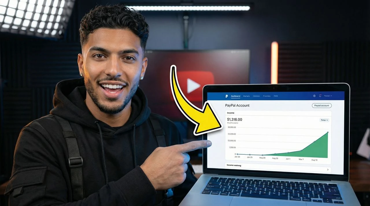
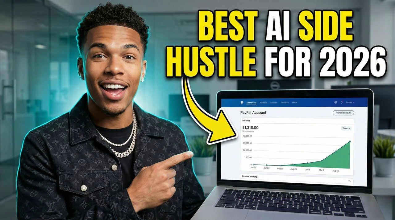
A real YouTube Studio graph — views, subscribers, revenue — with the exact point where something changed marked, is the niche's most reliable device. It promises a cause, not just a result. Crop tight so the curve's shape and one number read at feed size; a full dashboard screenshot at sidebar scale is an unreadable grey rectangle.
02

The thumbnail about thumbnails must be exemplary

Packaging advice is held to its own standard, so these videos need visibly deliberate craft: real hierarchy, one focal point, type that survives 168 pixels. Channels that publish a hasty design on a video about design lose credibility in the feed before anyone clicks. Treat your own as the demo it is.

03

Show the mechanism, not the milestone

"0 to 100K" is the outcome everyone claims; the packaging that converts shows the lever — a title rewritten, a retention curve at the 30-second mark, two thumbnail variants with the winner marked. Specific mechanism beats big number, because the audience has watched a hundred milestone videos and learned that most of them explain nothing.

04

The A/B pair as a single frame

Two thumbnails side by side with one marked as the winner is a format the audience instantly understands and can't get from a title alone. It works for titles, packaging, and channel-art videos alike. Keep the two halves genuinely different — a subtle variation is invisible at the size where the click happens.

05

Automation content needs a system, not a person

YouTube automation and faceless-channel-business videos package best as a visible pipeline: script to voice to edit to upload, shown as connected artifacts on a desk or a board. It matches what the buyer is actually shopping for — a repeatable operation — and it sidesteps the rented-lifestyle imagery that now signals a course seller to this exact audience.

06

Restraint is the differentiator in a niche that shouts

Creator-advice thumbnails have collectively escalated into shocked faces and red arrows, which means a calm, well-composed frame is now the pattern break. It also self-selects for the viewer worth having: someone building a channel seriously, rather than someone collecting growth-hack videos they'll never apply.

Longer version: the full creator economy thumbnail guide.

Creator Economy thumbnail ideas

Concept starters for your next upload. Each one already works as a prompt — copy a line into VisualKit and it will generate from it.

  1. 01An analytics curve with the exact change point circled and dated
  2. 02Two thumbnail variants side by side, the winner marked with a single check
  3. 03A retention graph with the drop-off moment highlighted
  4. 04A title rewritten in place — the old version struck through above the new one
  5. 05The faceless pipeline as four artifacts in a row: script, mic, timeline, upload
  6. 06A subscriber counter mid-change, everything else in the frame quiet
  7. 07A channel page before and after a packaging overhaul, same crop
  8. 08A CTR figure stamped over the thumbnail that earned it
Creator Economy workflow

How to make Creator Economy thumbnails

Three steps from a creator economy video idea to an upload-ready 1280×720 thumbnail.

01STEP 1: CREATE

Describe the video

Type the creator economy video idea in plain language. VisualKit generates 1280×720 options built on the packaging patterns above.

Built for creator economy thumbnails
Upload-ready 1280×720 output
Start from a title, hook, or rough idea
Live previewCreate
Prompt
Make a YouTube growth thumbnail: an analytics graph with the exact moment the channel changed, circled.
Pick your favorite16:9 · YouTube
Each option gets a score for how likely it is to get clicked.
02STEP 2: REMIX

Remix a reference

Paste a creator economy thumbnail that worked and rebuild it around your video, your subject, and your channel's look.

Keep the structure, change the story
Test a second hook
Stay readable at 168 pixels
Live previewRemix
youtube.com/watch?v=dQw4w9W...
Original
Original thumbnail style reference
RecreatedAI
Recreated version matches style
Detected style
Bold TextDark BGClose-upHigh Contrast
03STEP 3: IMPROVE

Fix it by typing

Say what should change — bigger text, different background, remove an element — and export when it reads at feed size.

Edit with plain language
Compare variants side by side
Download without resizing
Live previewImprove
Edit
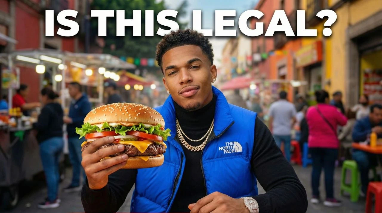
Make the vest blue, replace taco with hamburger
Drag to compare
After improvements resolved
Original thumbnail baseline draft
Before
After
Vest color -> blueTaco -> hamburgerContrast +18%

Make creator economy thumbnails with AI

VisualKit is a creator economy thumbnail maker built on these exact patterns. Describe the video, get 1280×720 options in about a minute, then change anything by typing what you want different.

Free generations on signup · plans from $40/month

Try this prompt

"Make a YouTube growth thumbnail: an analytics graph with the exact moment the channel changed, circled."

Choose your plan

Simple Pricing

Join 25,000+ creators making thumbnails that get clicks.

Starter

$20/mo

For creators posting consistently every month.

Includes:

  • Up to 50 thumbnails / month
  • Templates from top creators in your niche
Most Popular

Pro

$40/mo

For creators publishing several times a week.

Everything in Starter, plus:

  • Up to 150 thumbnails / month
  • Never miss a publish day

Ultra

🚀
$80/mo

For high-volume creators and teams.

Everything in Starter, plus:

  • Up to 400 thumbnails / month
  • Lowest cost per thumbnail for daily publishing

All plans include thumbnails, social content, app icons & logo creation.

Existing legacy subscribers keep their retired price while their subscription stays active. Canceling or switching plans moves future checkout to current public pricing.

Secure payment via LemonSqueezy. VAT calculated at checkout.

Creator Economy FAQ

More creator economy thumbnail questions

Demonstrate the advice. Use one focal point, real typographic hierarchy, and text that stays readable at 168 pixels — then let the subject be the comparison itself: two versions, a marked winner, a CTR figure attached to the frame that earned it. What fails is a generic shocked face over the word THUMBNAILS, because it shows none of the craft the video claims to teach.
Yes. Automation and faceless-business content sells a repeatable system, so the thumbnail should show the pipeline — script, voiceover, edit, upload as visible artifacts — rather than a person or a lifestyle. Rented-car and cash imagery is particularly counterproductive here, because this audience has learned to read it as the signature of someone selling a course rather than running channels.
It depends on whether your face is the credential. If the audience knows you and your results, a face works as a trust shortcut. If they don't, the analytics screenshot is the stronger claim, and a shocked expression over it actively undercuts it. Many of the best-performing channels in this niche use a small, calm face beside the data rather than a large reaction at full width.
There's no universal target — click-through rate varies enormously by traffic source, channel size and how much of your reach comes from subscribers versus browse. Comparing your number to a figure quoted in someone else's video is close to meaningless. The useful comparison is against your own channel's baseline, one variable at a time, which is exactly the kind of test this niche's thumbnails should be showing.

Make creator economy thumbnails that get clicked

Describe your video and get niche-correct 1280×720 options in about a minute — these patterns, applied for you.