Creator Program:Earn $3 per subscriber you refer.Fast payouts, instant approval.

Health & Medicine YouTube Thumbnails: Examples, Ideas & What Actually Works (2026)

Health & Medicine YouTube thumbnails: examples, ideas and the packaging patterns that earn clicks in the health niche. VisualKit is a health thumbnail maker that applies these patterns to your video idea.

What makes a good health YouTube thumbnail?

Health & Medicine YouTube thumbnail ideas

How to make health thumbnails

  1. Describe the video, for example: Make a health thumbnail: one clear diagram of the mechanism, sober type, nothing exaggerated.
  2. VisualKit generates 1280×720 options using health packaging patterns.
  3. Edit any option by typing the change you want, then export.
All 39 niches

Health & Medicine YouTube thumbnailsthat actually get clicked

Health is the niche with the strictest packaging constraints on YouTube, and the ones that matter aren't aesthetic. Medical content sits inside YouTube's health policies and gets held to a higher standard on misinformation, so a thumbnail that overstates a claim can cost the video its reach regardless of how careful the script was. The channels that grow here have converged on a sober visual language borrowed from medical illustration — and it turns out the restrained version also performs, because trust is the thing the audience is shopping for.

Free generations on signup · Patterns reviewed

What makes a good health or medical YouTube thumbnail?

A clean diagram with one structure highlighted, a sober clinical palette, and a question rather than a promise. This audience is assessing trustworthiness before anything else, so visible credentials on clinician-led channels and restrained medical-publishing colors do more for the click than intensity. Isolate a single mechanism — the viewer usually arrived with one specific question.

  • 01The diagram is the strongest asset
  • 02Credentials belong in the frame
  • 03Sober color reads as clinical

What works in health thumbnails

Patterns that repeat across the health channels that are growing — and the mistakes sitting next to them in the same feed.

01

The diagram is the strongest asset

A clean anatomical or mechanism illustration with one structure highlighted communicates 'this video explains how something works' faster than any photograph. It's also the safest imagery in the niche — it makes no claim about a person or an outcome. Keep it to one system with one labelled element; a full anatomical plate is unreadable at feed size.
02

Credentials belong in the frame

For clinician-led channels, a visible marker of expertise — scrubs, a white coat, a clinic setting, or simply a calm professional presentation — functions as the trust signal that carries the click. This audience is explicitly assessing whether you're qualified before deciding to believe you, and the thumbnail is where that assessment starts.

03

Sober color reads as clinical

Blues, greys, clean whites and restrained accents borrow the visual register of medical publishing. Alarm-red gradients and shock typography push a video toward the health-misinformation-adjacent bucket in both the audience's perception and the platform's, and channels that lean on them tend to find their reach quietly capped.

04

Frame the question, never promise the outcome

"What actually causes it" outperforms "the cure they don't want you to know", and it's the difference between a durable channel and a removed video. Cure claims, miracle-result promises and anything implying a treatment is being suppressed run directly into YouTube's medical misinformation policies. The question framing is both safer and a better hook, because it promises understanding rather than a product.

05

Before/after is the highest-risk format here

Body and treatment transformations are heavily constrained: they can breach policies on body image and unrealistic results, and they attract advertiser restrictions even when they're genuine. Where a comparison is genuinely the subject, a diagram of the mechanism or a chart of a documented result is the version that survives — and it says more about why it worked than a photo pair ever does.

06

One mechanism, not a list

The clearest health thumbnails isolate a single process — one organ, one pathway, one nutrient, one interaction. Multi-item roundups compress into visual noise and also weaken the promise, since the audience is usually searching about one specific thing. Specificity is what makes the video feel like it was made for their question.

Health & Medicine thumbnail ideas

Concept starters for your next upload. Each one already works as a prompt — copy a line into VisualKit and it will generate from it.

  1. 01A single-organ diagram with one structure highlighted, everything else muted
  2. 02A two-state mechanism illustration: normal on the left, affected on the right
  3. 03A clinician in a clinical setting, calm, one diagram held in frame
  4. 04A chart of a documented result with the axis label legible
  5. 05A cross-section with one labelled arrow and no other text
  6. 06A common myth written plainly, with a question mark rather than a verdict
  7. 07One food or compound isolated on a neutral ground, molecule inset small
  8. 08A timeline of a process with one stage marked as the turning point
Health & Medicine workflow

How to make Health & Medicine thumbnails

Three steps from a health video idea to an upload-ready 1280×720 thumbnail.

01STEP 1: CREATE

Describe the video

Type the health video idea in plain language. VisualKit generates 1280×720 options built on the packaging patterns above.

Built for health thumbnails
Upload-ready 1280×720 output
Start from a title, hook, or rough idea
Live previewCreate
Prompt
Make a health thumbnail: one clear diagram of the mechanism, sober type, nothing exaggerated.
Pick your favorite16:9 · YouTube
Each option gets a score for how likely it is to get clicked.
02STEP 2: REMIX

Remix a reference

Paste a health thumbnail that worked and rebuild it around your video, your subject, and your channel's look.

Keep the structure, change the story
Test a second hook
Stay readable at 168 pixels
Live previewRemix
youtube.com/watch?v=dQw4w9W...
Original
Original thumbnail style reference
RecreatedAI
Recreated version matches style
Detected style
Bold TextDark BGClose-upHigh Contrast
03STEP 3: IMPROVE

Fix it by typing

Say what should change — bigger text, different background, remove an element — and export when it reads at feed size.

Edit with plain language
Compare variants side by side
Download without resizing
Live previewImprove
Edit
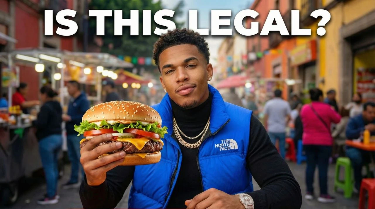
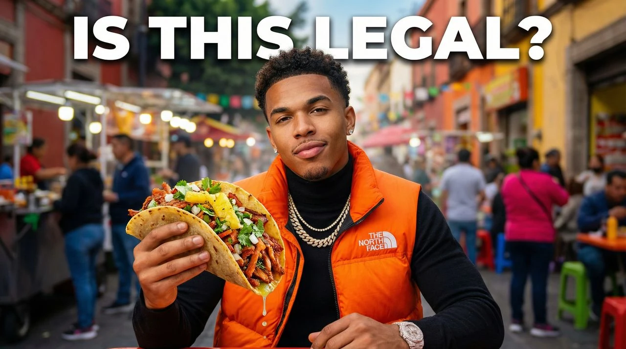
Make the vest blue, replace taco with hamburger
Drag to compare
After improvements resolved
Original thumbnail baseline draft
Before
After
Vest color -> blueTaco -> hamburgerContrast +18%

Make health thumbnails with AI

VisualKit is a health thumbnail maker built on these exact patterns. Describe the video, get 1280×720 options in about a minute, then change anything by typing what you want different.

Free generations on signup · plans from $40/month

Try this prompt

"Make a health thumbnail: one clear diagram of the mechanism, sober type, nothing exaggerated."

Choose your plan

Simple Pricing

Join 25,000+ creators making thumbnails that get clicks.

Starter

$20/mo

For creators posting consistently every month.

Includes:

  • Up to 50 thumbnails / month
  • Templates from top creators in your niche
Most Popular

Pro

$40/mo

For creators publishing several times a week.

Everything in Starter, plus:

  • Up to 150 thumbnails / month
  • Never miss a publish day

Ultra

🚀
$80/mo

For high-volume creators and teams.

Everything in Starter, plus:

  • Up to 400 thumbnails / month
  • Lowest cost per thumbnail for daily publishing

All plans include thumbnails, social content, app icons & logo creation.

Existing legacy subscribers keep their retired price while their subscription stays active. Canceling or switching plans moves future checkout to current public pricing.

Secure payment via LemonSqueezy. VAT calculated at checkout.

Health & Medicine FAQ

More health thumbnail questions

Cure and miracle-result claims, packaging that contradicts established guidance from health authorities, and framing that implies a treatment is being suppressed all run into YouTube's medical misinformation policies — and the thumbnail is judged alongside the video, not separately. Body transformations and unrealistic-result imagery carry additional advertiser restrictions. The consistently safe framing is explanatory: what causes this, how this works, what the evidence shows.
It's the riskiest format in the niche. Body and treatment comparisons can breach policies on body image and unrealistic results, and they draw advertiser restrictions even when entirely genuine. Where a comparison genuinely is the subject, a mechanism diagram or a chart of a documented outcome is the version that survives — and it explains why the change happened, which is the more useful promise anyway.
Use it for illustration, not for evidence. Generated diagrams, stylised anatomy and conceptual visuals are reasonable when clearly illustrative — but anatomical accuracy matters in this niche, and generated images frequently get structures wrong in ways a knowledgeable viewer will notice immediately. Never generate anything that could be read as a real scan, chart, or clinical photograph; in health content, fabricated evidence is a category of harm rather than a design shortcut.
Because the audience is deciding whether to believe you, not whether to be entertained. Alarm-red gradients and shock typography are the visual signature of the health content that gets things wrong, so the informed viewers — and the ones advertisers pay for — filter for the opposite. The restrained version also keeps the video inside policy, which means it keeps its reach.

Make health thumbnails that get clicked

Describe your video and get niche-correct 1280×720 options in about a minute — these patterns, applied for you.